As you may have noticed I have a bit of a thing for maps. I often go out of my way to find a way to present statistics in map form, because it’s fun, and also because I think it’s important to understand regional variation in China (here’s one recent attempt). But that kind of map where different areas are colored in to convey information, known as choropleths to infographics aficionados, has some drawbacks when applied to Chinese provinces. Namely, the size of Chinese provinces varies hugely. A standard map is visually dominated by Xinjiang and Tibet, which happen to have few people and small economies, while the economic powerhouses of Beijing and Shanghai are barely visible.
This is in fact an extreme version of the problem faced when mapping the US, which also has some big empty states and small populous ones. A recent solution adopted by many infographics mavens is to make all the states the same size; the resulting “grid” maps, usually made up of squares, have been the talk of the infrographics community. Recently the folks over at NPR came up with an even cooler solution, which is to use hexagons rather than squares. This allows the resulting layout of tiles to more closely approximate geographic reality and the well-known shape of the US. I quite like it:
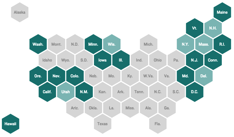
Naturally, this presented a challenge: can this same technique be applied to China? You betcha. After some playing around I came up with the following solution, which preserves both the chicken-shaped outline of China, and is reasonably accurate about the positions of individual provinces relative to each other. The biggest compromise with reality I made was to pull off the coastal municipalities (Beijing, Tianjin, Shanghai) from the main part of the map. This makes it easier to get the relative positions of the remaining provinces correct.

I’m pretty pleased with this (though suggestions for improvement are naturally welcome). Now for the test: does the hexagon tile map work better at presenting information visually? Here’s a map I produced earlier this year, which highlights the regional variation in economic growth across China.

And here’s the same statistical information presented in a hex tile grid map.

The differences are interesting. The traditional map presentation works quite nice visually, because the big swath of the slow-growing black and red provinces across the north half of the country conveys a daunting impression. The hex map, as intended, lessens the visual impact of the large but less-important western provinces, and makes it clearer what is happening in the municipalities. It also makes it easier to see how many provinces are growing slowly versus how many are growing more quickly (and has the added benefit of being able to fit in province names, which is hard to do legibly on a regular map). It’s a bit less scary as a result, since you can see that there are still more fast-growing ones than slow-growing ones. So it seems like the hex map is best for illustrating data where the important point is the number of provinces meeting various criteria. I’m not sure for this particular example I would prefer the hex map, but it was certainly fun to explore.

This is really interesting, and I appreciate that you make Beijing, Tianjin and Shanghai stand out in a way. The only thing I would suggest is that maybe it’ll be geographically more accurate if Xinjiang, Qinghai and Tibet are moved downwards for a unit.
Also, I’m wondering if there’s a way to access this map via R or an R package.
Thank you! Sadly I can’t give you R code for the map, as I drew it “by hand” in Illustrator.
I gave it a try using Illustrator as well (moving Xinjiang, Qinghai and Tibet downward for a unit). Don’t know which one you would prefer, but I thought you might be interested to have a look. https://github.com/bctclc/China-s-Internal-Migrants-and-Their-Lives/blob/master/Profolio%20-%20eng/1total%20population%20v2.pdf